Too many windows


Too many windows
Max
This week I improved the Job UI, because there were too many windows open at the same time.
When you pressed „Create Job“, the „create“ window and also the „character“ and „inventory“ windows opened. The result was that your whole view was full of windows. So the solution was to change the way you add rewards to the job.
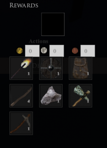
In the old job UI you had 9 spaces for items, and you had to drag the item from the inventory to the slot. Now you only have one reward slot and as you click on it, a small dropdown opens with all your inventory items. You can click
one item so it is added automatically to the slot and another free slot will be added. This way you only need to have the „job-create“ window open.
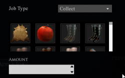
Another change in the job UI is that you don’t have a text input field for the collectable type anymore. Instead, there is an area with all items that are in the game and you can click one of them so it will be selected. Now you only need to add an amount and you are ready to go!


